Visual user interfaces have a profound impact on user experience when it comes to web & mobile apps. Here are some truly great ones to inspire you to create more of the same.
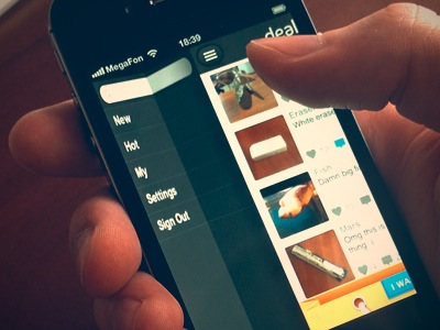
Pull/Unfold
Here’s one posted by Cuberto on Dribbble. This graphical user interface is designed to look like a piece of paper unfolding; slide right to pull up a hidden dashboard screen; slide left and the interface refolds to again hide the dashboard. In the example below, the left to right slide gesture is hierarchical– essentially, left to go back/access top nav actions, right to move forward/return to 2nd nav interface. See other instances of this how this fold element is incorporated into mobile UIs on Dribbble here.
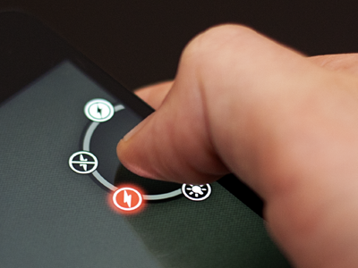
Rotate
When you use a camera, there is a rotary that you turn in order to adjust picture-taking settings and conditions. Paul Flavius Nechita has translated that physical interface into an iPad design that mimics the same usability principles using a rotation gesture. Cool. Another example of circular UIs for gestures below.
Push/Select
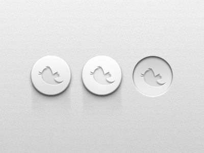
I wouldn’t be surprised if this twitter button (posted on Dribbble by Matt Gentile) has a pretty high click-through rate because of its tactile appearance & sticky behavior. Some strategically placed drop shadows make the user experience feel like you are actually pushing a button. The “sticky” element contributes to this experience since once clicked or touched, the button remains inverted.
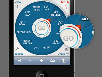
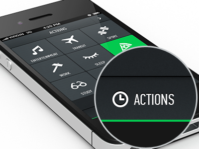
Here’s is another beautiful and simple UI that utilizes the tap/select gesture; featured below is a visual dashboard. Love the color change for the active state. Posted on Dribbble by Artsiom Grlmc.
GUI buttons posted by Adrien Olczak on Dribbble. Very realistic. (below)
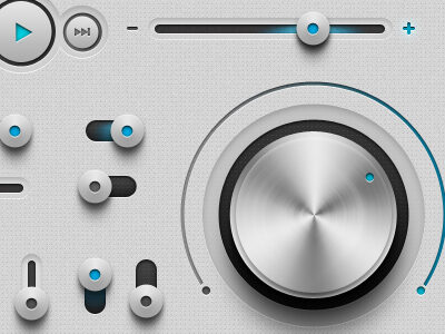
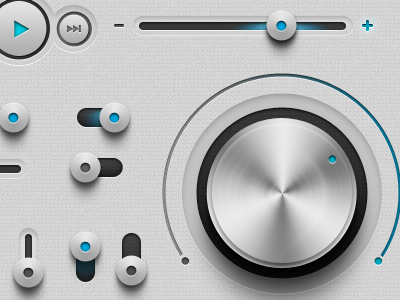
Multi
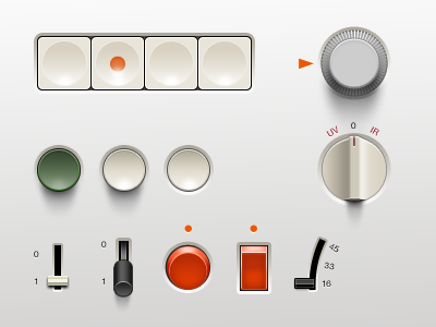
The first image below is a graphical interface designed to function as a controller. The design is clean and overtly simple to compliment the rich functionality it will support through gestures– push, pull slide, rotate. A design that is crowded or too colorful or busy would make for a terrible UX. This follows best practice for GUI’s- keep it simple.
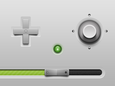
Audio/stereo interface design (below.)
Horizontal Slide
The interface below is designed for landscape view and looks like it incorporates gestures to imitate how you’d thumb through a book. The menu tabs on the left with vertical titles do for the user what breadcrumbs do on desktop; a slide of the finger gives users an organized way to easily flip back and forth between more narrow and more general search results.
Here’s another one from Magdalena Dymanska on Dribbble.
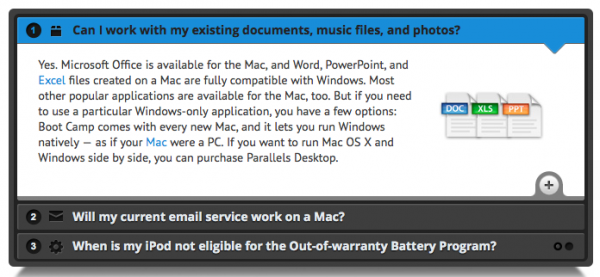
Vertical Tap & Scroll
This is a vertical accordion slide. The interface is designed to layer content without moving into a separate UI to access the more detailed information. If you tap each FAQ sentence, this UI works as a show/hide for desktop.
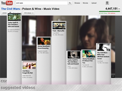
The UI below is posted by Osagie Igbeare on Dribbble. It’s designed for YouTube– the white overlaid columns show suggested videos, and their height is proportional to the number of views that video has.
Pinch
There’s an iPhone app called Clear that pretty much uses this one element- vertical accordion slides– to construct the entire GUI; but the use of gestures and color gradients is what dictates the order, priority, and status of to-do list items. Clear uses the pinch function in crazy ways to let users organize their lists hierarchically. Just try it.