
When creating design systems, we need to begin by considering our own real-world examples to craft a system that will support realistic use.
We often start to think about the myriad of interface elements that will need to be included, as well as the states and variations of each. Some of us start to mentally organize these elements into an information architecture that feels logical and can be easily understood and adopted by design system users.
But how often do we begin by considering our own real-world examples of web and product UI as a living example of what we’re attempting to abstract in the system? And more specifically, how might we use these artifacts and leverage our marketing and copywriting colleagues to craft a system that will support realistic use cases?
What Is a Design System?
Backing up just a bit, we should first define what a design system is. InVision offers a succinct definition: ”A design system is a collection of reusable components, guided by clear standards, that can be assembled together to build any number of applications.”
What separates design systems from style guides, pattern libraries or “UI sticker sheets” is primarily documentation in addition to functional code snippets based on the components.
How to Create a Design System
Usually design systems are the work of a dedicated team of strategists, designers, and developers who have buy-in at the departmental or organizational level. The initial effort should be treated like any project or product. The initiative needs the resources necessary to approach the effort in a detailed and comprehensive way, with an eye toward maintenance and updates down the road.
Different teams will have varying processes, but generally the flow to create a design system will follow something like this:
- Identify and define all of the component types possible
- If the intent is to redesign a website or product, produce variations of components that can be reviewed and approved as a group
- Commit each component to the system, along with each state and variation
- Document each of the components and their permutations with your preferred software
- Set up a development environment in which components are coded and made available as code snippets
- Define and support an ongoing maintenance effort of the system, ensuring sites and products are adhering to it, and accounting for anything that would need to be added to it
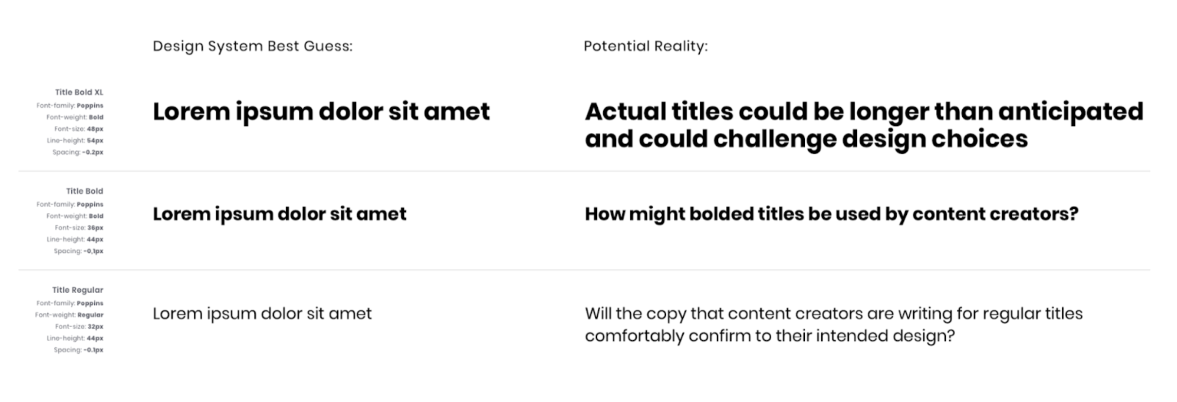
One step that isn’t always accounted for, however, is stress-testing certain components for messaging and direction from content professionals. If you’ve ever witnessed a design project where the team hasn’t been given the client’s final content then you can probably picture this scenario: The designer has mocked up a gorgeous Homepage layout with a great use of composition, typography, color, and calls-to-action. Then the client delivers the content and it is double or triple the amount of text the designer accounted for.
This example, much to the chagrin of many web designers, is actually quite common. It’s difficult to write copy, so it tends to be something that arrives later in the project. In its absence, the designer has likely substituted “Lorem ipsum” for the headings and body text. While that usually looks great, we have to remember that it’s only a placeholder and has been edited down to fit a specific shape or amount of text that the designer chose for the layout. In other words: it isn’t real.
Working with Content in a Design System
In a 2021 study published by Content Science Review, author Michael Haggerty-Villa found that only about 30 percent of design systems accounted for content, which he refers to as “Copy, Microcopy, or Writing.” He goes on to define the key elements of content in design systems as:
- Content
- Style
- Voice/Tone
- Content in Components & Patterns
- Content Patterns or Types
I think the most obvious, immediate crossover between this definition and what’s lacking in many design systems relates to “Content in Components.” This simply means that just like our website example, designers may be creating components and setting type styles within the design system with only a best guess as to what messaging content producers plan to publish.
This will generally affect websites much more than digital products, but design systems for any digital property can only benefit by including content stakeholders to stress-test patterns against reality and put things in finer context.
A colleague of mine currently working on a design system had this precise situation arise when needing to demonstrate a type scale without having any sample content. They reviewed the current digital property and made an educated guess estimating how much content they thought would appear in headings and body copy. They then worked with a front-end developer to review how these samples would render on various devices and screen sizes to arrive at what felt like a realistic scenario.
Moving Forward
So what are some simple ways designers can ensure their design systems are accounting for content? Andrea Burton of Abstract argues that it’s time to give content strategists a seat at the table.
She writes: “A handful of design system teams have begun including content sections within their documentation sites. By doing this, they are defining so much more than just the voice and tone of content being written into the product UI. They are specifying naming rules. They’re helping people figure out what grammar and vocabulary to use. They also include content guidelines for each component, which helps understand what content to use for each specific context.”
While producing and managing design systems is a big effort and requires multiple stakeholders each doing their part, it’s clear that context is everything in terms of how these systems will be applied and how their resulting interfaces will be consumed by their users.
Engaging content creators to join the effort and define aspects such as style, voice, tone, and how content will interact with UI components is something we’ll be seeing a lot more of in the near future, and for good reason.