User testing surveys conducted across diverse markets show clear and universal results. Information addressed to folks with dyslexia improves usability for all.
Understanding the challenges
Writing is the heartbeat of every successful website. Good copy defines intuitive, “don’t-make-me-think” user journeys. Words frame the path(s), anticipate questions, and guide users to success. Clear writing improves user satisfaction and keeps customers coming back for more.
Accessible writing adds layers of expertise to the process. Writing for accessibility means understanding the taxonomy of information and re-architecting where necessary. Taxonomy nodes, or chunked information, deliver clear, to-the-point language. These unfolding chunks create top-to-bottom intuitive and seamless user journeys.
Why should we care? Why does readability and the organization of language matter? Depending on the source, 5 to 15% of Americans, that’s 14.5 to 43.5 million children and adults, have dyslexia. Regardless of their IQ, these people struggle to read.
Folks with dyslexia often skip words, lines, or even pages of text. Often, they read slowly and find decoding words to be a challenge. They may misinterpret information on your site and leave. Or they may need costly support to complete your basic, required tasks.
Unfortunately, dyslexia likes company. It’s often accompanied by working memory, attention, and math challenges. Challenges similar to the everyday struggles many of us face in our information age. When was the last time you had to piece together key information across a website or email? How many times have you needed to reread poorly structured copy?
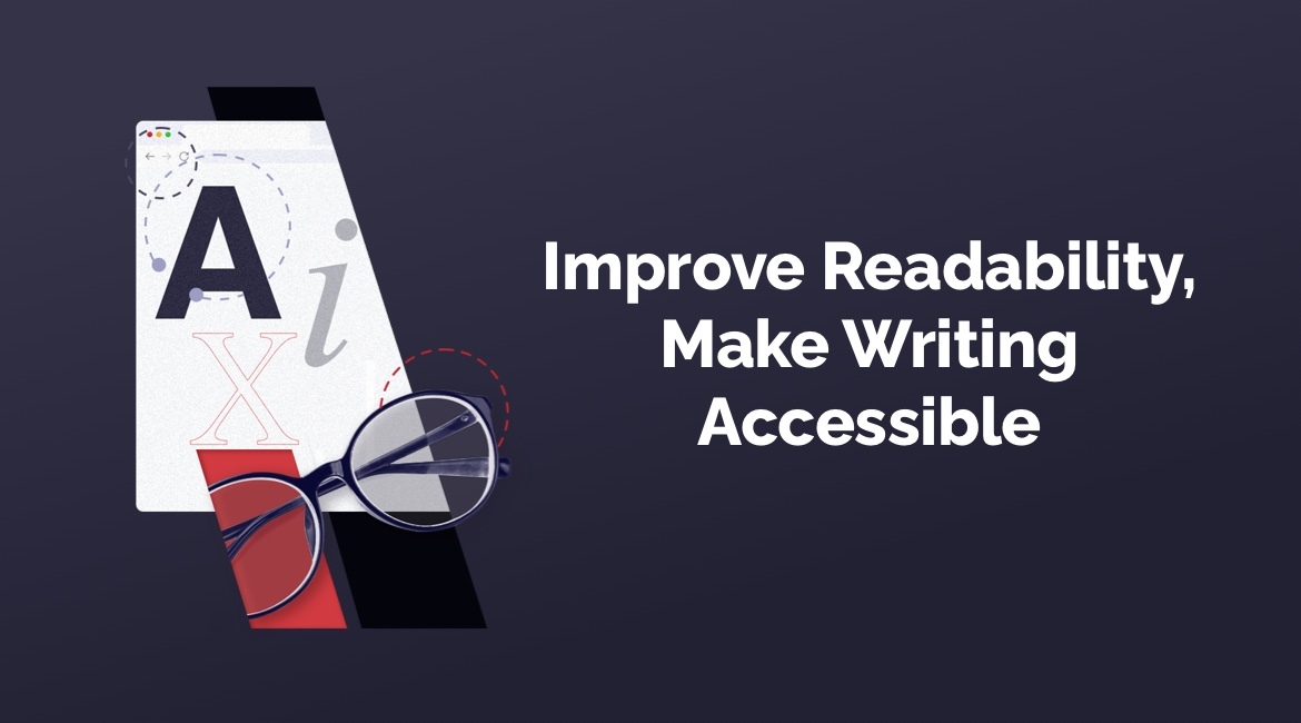
Images matter
Remember those beautifully illustrated early-childhood books? These books don’t come home with children diagnosed with dyslexia. Focusing on decoding means removing images that can augment meaning.
If the first thing educators do is to remove this crutch, we need to place descriptive images front and center. Descriptive, but not decorative, images and icons support clear copy. They make it easier for folks who struggle to read to fill in their missing information gaps.
Think of text and images as a signage partnership. The color red, in the American culture, partners with words and shapes that alert to danger. Yellow partners with warning words, while green rectangles signify road information.
We don’t pause and read the word STOP before we begin to brake. Would we automatically brake if red changed to green? What if the shape or word on the STOP sign changed? Consistency breeds automaticity and reserves brain function for the kids playing in the road around us.
Our brains also need consistent information across the entire user experience. Even subtle inconsistencies can confuse and alienate users. Like signs on a road, our user journeys need clear and consistent language and markers.
Facts and fonts are game changers
Fonts give shape to words – they’re not art. Use sans serif fonts such as Arial and skip dyslexic fonts.
User studies show that critical information is easier to locate with a larger font size. For example, hours of operation, pricing, and availability. Even the simple realignment of data around larger font info can make a difference. In one study I ran, a user reported reaching for her glasses. She noted that she was aware that the font size was the same for the explanatory text. What changed? The key text was no longer enlarged and spaced for easy access.
Minimize content
Fewer words reduce cognitive load. This is the brain work required to move and store new information into working memory. From there, this information moves into long-term memory.
Use headings to chunk info and let users scan to quickly find info. Put the required or key info up front. This applies not only to sentences, but to paragraphs and page structure. When you place the key info in the eye tracking path, people are more likely to get it. For more information, see the Nielson Norman Group’s eye tracking studies.
Keep your sentences to 20 words or fewer. Ditch the words that add little to no value to your writing such as very, really, in reality, however. Monzo’s Style Guide does an excellent job of summing up the research. 21+ word sentences are hard to read. 11-word sentences are easy, and at 14 words readers understand over 90%. When the sentence grows to 43 words, understanding drops to less than 10%.
Break out the thesaurus and find the perfect word. Words influence not only what we see as choices but the results we obtain. For an interesting study on word choices see the following from Monzo’s Style Guide:
Labels Matter More Than You Think
It might seem pedantic to care about whether we say ‘guys’ or ‘folks,’ but how we label things really matters.
Psychologist Lera Boroditsky ran an experiment in 2009 that makes this point really well.
She told two groups of people that they were in charge of solving the problem of crime in the fictional city of Addison. The scenarios were identical in every way except one: she told one group that crime was ‘preying on the city like a beast,’ and the other group that crime was ‘spreading through the city like a virus.’
The group who were given the beast ‘frame’ were much more likely to propose things like more police and tougher sentencing. The group with the virus frame were much more likely to suggest social reform and education.
No matter how she rejigged the experiment, with groups based on people’s gender, background, age or political persuasion, the beast and virus frames were the bigger factor in influencing how they responded.
We’re much more susceptible to this kind of ‘framing’ than we realize. And the labels we choose for things are often signals of biases we might not know we have. So being more thoughtful about the terminology we use us a great way to uncover and overcome them, as well as making sure we don’t accidentally upset or offend anyone.
When you write like you minimize your closet, you spend less time and focus on the meat. You can also serve several audiences with one source. Your readers benefit because they can get their essential tasks done.
Details matter
Empower your users using the active voice. Aim for a fifth-grade reading level whenever the content allows. A friendly voice encourages readers to succeed and can even be a brand asset.
Contractions are the way we talk and add a friendly tone to our copy. Reconsider contractions for destructive actions, particularly if the action cannot be undone. Many people with dyslexia have difficulties processing contracted words.
Creating a list? Skip the introductory sentence that’s covered by the preceding title. When listing steps, put “Optional” in parentheses before the action. For example: (Optional) Phone number. Don’t tell me after I enter my info that I didn’t need to do this.
Use bulleted lists for items that don’t require ordering. For example, cake ingredients can be purchased in any order. Numbered lists specify ordered steps. For example, it matters if I mix the cake batter before I put it into the oven.
When possible, alphabetize bulleted lists for easy scanning. Keep each bullet point to a few words with no period at the end. Use a unique key word at the beginning of each bulleted phrase.
Using numbers in a sentence? Ditch the one to nine convention and use numerals for all of your numbers. Numerals are much easier to read.
Large pages of text are often referred to as walls of text. Break these walls or long lists of multi-paragraph chunks with toggles. Toggles let users access and even compare only what they need.
Finally, type in or copy-paste your text into the free Hemingway App. See the reading grade level, instances of passive voice, and words with simpler alternatives…. This article was written using the Hemingway App.
As WCAG moves to address cognitive challenges, its guidelines are changing. As an invited expert to the working group for plain language, I recommend these tips. Accessibility is not only the right thing to do, it’s an ethical imperative that serves everyone.
Other Relevant Articles
Read more posts about Digital Transformation