Designing for Accessibility
Unequivocally, making your website accessible to your audience, whether or not they have disabilities, is the right thing to do.
It can also be pretty hard!
There are regulations and rules you need to be aware of, it may take another round of QA if you’re not working with an experienced team, and it may require partnering with a consulting organization that specializes in accessibility.
Over the past decade or so, we’ve honed our accessibility experience and coached some of our partners on how they can better incorporate accessibility into their digital experiences.
The best way to make an accessible digital experience is to start with accessible design. In this article you’ll learn some important considerations for accessibility that you should address during the design phase.
While this is not an exhaustive list, it is one of the best ways to begin to incorporate inclusive design into your projects.
We’ll cover:
- Color contrast
- Focused states
- Form field labels
- Text in images
We’ll also wrap up with some more resources on accessibility so you can go deeper if you’d like to.
Contrast and Color Accessibility
The first consideration is one of the most difficult because it impacts branding that may not have been created with accessibility in mind. The color and contrast of your designs not only affect their emotional impact, but they also are a major factor in whether or not your visual content is legible.
Parsing the difference between the foreground and the background is essential to understanding content, and when there’s low contrast they tend to blend together. The more they blend together, the harder it is to separate them visually. To help solve for this, the Web Content Accessibility Guidelines (WCAG) 2 stipulate a minimum level of contrast between the foreground and background colors.
In this context, the “contrast” between two colors is the difference between the brightness (“luminance”) of each. WCAG 2 measures this as a range of ratios from 1:1 to 21:1.
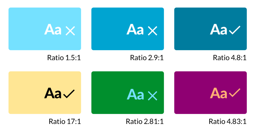
To meet the minimum requirements for WCAG 2 Level AA, the contrast ratio for text (and images of text) must be at least 4.5:1.
There are some notable exceptions to this rule. Here are the exceptions to minimum contrast ratios from WCAG 2:
Large Text
Large-scale text and images of large-scale text have a contrast ratio of at least 3:1;
Incidental
Text or images of text that are part of an inactive user interface component, that are pure decoration, that are not visible to anyone, or that are part of a picture that contains significant other visual content, have no contrast requirement.
Logotypes
Text that is part of a logo or brand name has no contrast requirement.
Making Your Brand Colors Accessible
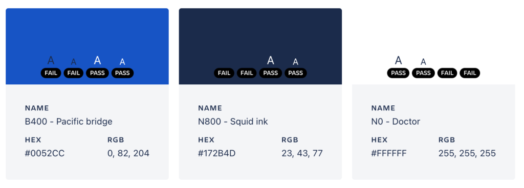
Atlassian, a suite of product management SaaS tools, clearly thought about accessibility when designing their branding. They do a great job of outlining which of their brand’s colors are safe to use at various sizes and on various backgrounds in their brand guidelines:
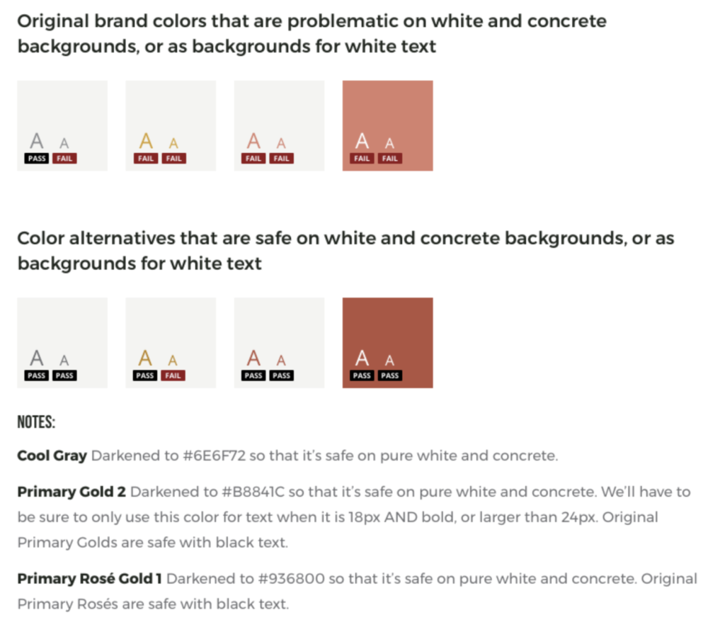
Similarly, at ADK we create documentation when we encounter brand colors that may have a color contrast lower than 4.5:1 when combined. Take a look at the example below from a brand guideline we created with a popular champagne brand.
How to apply this concept
While in design:
While working through your brand’s color palette, you should also confirm which color combinations are safe to use for text on your website or app. There are a lot of useful tools out there you can use, but here are a few you contrast checkers can use while designing:
- The WebAIM Contrast Checker is a great place to start if you’re just trying to test individual colors against each other.
- Whocanuse not only checks color contrast, but visually demonstrates how your tested color combinations might look to users with many kinds of visual impairments. I use this most often to help our clients understand why certain color combinations might be problematic.
If you’re trying to test a whole batch of brand colors against each other, you can upload multiple colors at once to the Accessible Brand Colors tool. It will output a matrix of results that clearly display which color combinations are safe, and which aren’t.
Tools to audit a live site for an accessible contrast ratio
If your site is already live, you probably want to make sure what’s up there isn’t violating any WCAG 2 guidelines for the contrast ratio. Luckily, there are a couple browser extensions (for Chrome) that can check any site’s color contrast for you:
- WCAG Contrast Checker – This extension will quickly run a color contrast audit on any page on your website.
- Axe – Web Accessibility Testing – Created for developers, this extension will run a comprehensive accessibility audit on your website, including checking text colors for contrast.
Focused States for Form Elements, Buttons, and Links
With your colors sorted, you’re likely ready to focus on a major part of your design system: building out your UI library. While setting this up, you should make sure to design for four states of clickable elements:
- Default
- Hover
- Disabled
- Focused
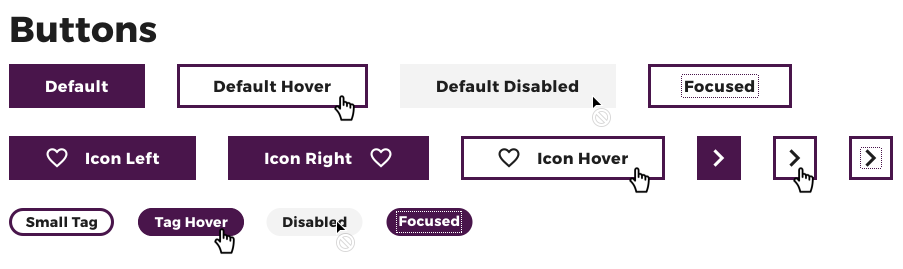
Focused states may be new to you, and that’s ok! You’re in the right place. Focused states highlight the interactive elements on your website, which helps users who use a keyboard to navigate.
Making sure you’ve designed accessible focus states helps you meet WCAG Success Criterion 2.4.7 Focus Visible (Level A):
“Any keyboard operable user interface has a mode of operation where the keyboard focus indicator is visible.”
How to apply this concept
The basic goal of a focus state is to help draw the user’s attention to the relevant element. Because of that, trying to make them blend in is a no-go. Instead, your focus should be on implementing them in a way that serves users with disabilities and adds to the overall experience.
To do that, your focused states must:
- Have a contrast ratio of at least 3:1 with the background, though we recommended you meet the same level of contrast you’re achieving for text accessibility (a minimum of 4.5:1)
- Be differentiated from other states, like hover, with a unique visual indicator. This could be an outline or a highlight, for example.
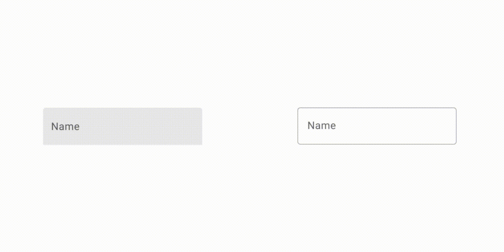
Making Form Fields Accessible with Labels
This consideration is another example of accessible design overlapping with good UX. To meet WCAG Success Criterion 3.3.2 you’ll need to make sure the form fields you’re designing have clear labels or instructions.
One of the most common ways we’ve seen websites fail this WCAG 2 test is by using the field’s placeholder as a label. This is a problem for a couple of reasons:
- The placeholder disappears as soon as a user begins typing
- Screen readers don’t process placeholders as a field label
How to apply this concept:
This can be accomplished by ensuring that all fields within your design system include independent labels.
Of course, there are creative ways to have your placeholder cake and eat it, too. For example, Material Design from Google outlines a way to have the label appear as placeholder text initially, until a user focuses on the element.
Avoiding Text in Images
We get it. You’ve got a cool graphic with a brand font you can’t usually use on your website. The problem is, if it contains important information for your users, visually impaired people are going to have a hard time getting that information.
They usually will have to rely on the text alternative (or “alt text”), but it’s often difficult to capture the meaning and impact of the image within that text.
The other downside is that text within flattened images can’t be customized. This type of text won’t be affected by translations or increased text size, meaning users that don’t use screen readers but do need larger or translated text will not be able to understand the message in your image.
That’s why our team avoids using images of text at almost all costs. This helps us meet the WCAG Success Criterion 1.4.5 for Level AA:
If the technologies being used can achieve the visual presentation, text is used to convey information rather than images of text except for the following:
- Customizable: The image of text can be visually customized to the user’s requirements;
- Essential: A particular presentation of text is essential to the information being conveyed. Note: Logotypes (text that is part of a logo or brand name) are considered essential.
How to apply this concept:
It’s pretty simple: avoid relying on text in images. You may still run into situations where text in an image must be used. It happens. When it does, just make sure that the text alternative (alt text) contains the same text presented in the image.
More Resources for Accessible Design
The best place to start is with the canonical, primary source. In this case, that’s the comprehensive guide Understanding WCAG 2.0: A guide to understanding and implementing Web Content Accessibility Guidelines 2.0, created by the W3C.
To help keep these top of mind, these Designing for Accessibility posters created by the homeoffice.gov.uk are great reminders of how you can make your website or service accessible for users with many different access needs. At ADK, we have them printed out and hung up at our offices.
Need more help making your site or app accessible?
One of the most efficient ways to make sure your digital experience is accessible and inclusive is to work with a partner that has a proven track record of accomplishing that. At ADK, our designers and developers have years of experience helping forward-thinking companies make their experiences more accessible for all. If you’re looking to learn more about our experience with accessible design and development, send us an email at info@adkgroup.com.
Related Posts
To make a truly accessible digital experience, you must start with accessible design. Learn some key accessibility considerations for the design phase.
Experience Design