Introduction
First things first: there are many different mobile navigation patterns, developed for many different reasons, solving many different problems. When designing mobile navigation for a website or application, always prioritize what your product’s main goals are, and who you are designing it for. A content-heavy news platform targeting users over the age of 50 will require a completely different navigation solution than a photo sharing application targeting young adults would. There’s no magic pill that will work in every situation for every user.
However, regardless of what you’re building, you want to avoid confusing new users with unexpected or difficult designs for key functionality. One functionality like that is your navigation.
Designing for Reachability
Your core goal is to make your navigation easy to identify and interact. Where you place it, therefore, is one of the most important choices you can make.
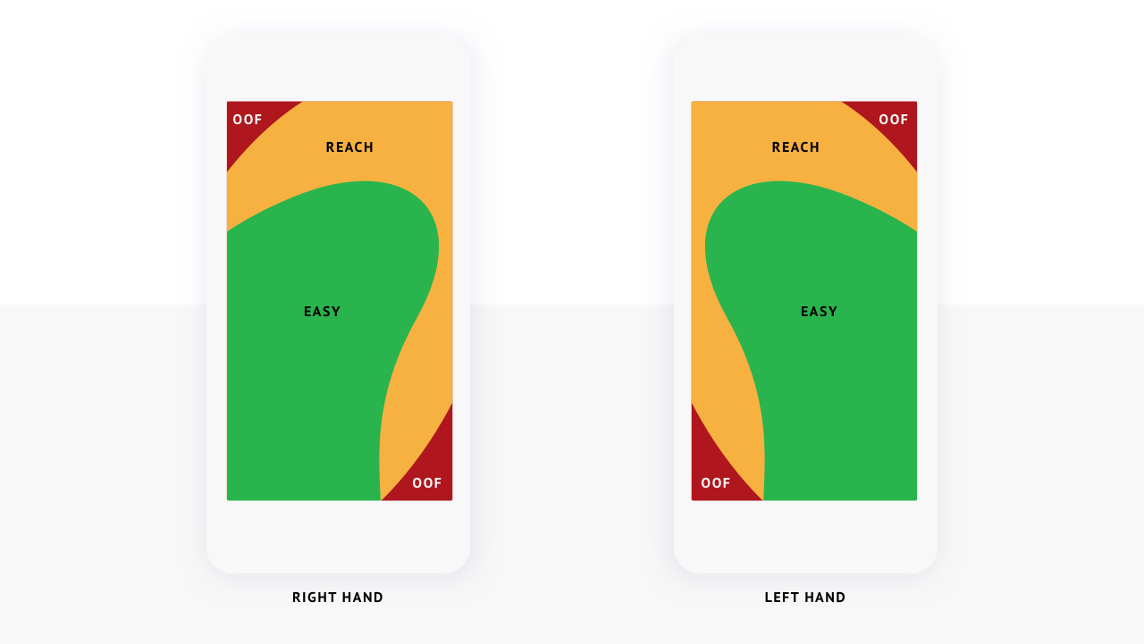
Users hold their mobile devices in many ways, and often move and adjust their grip to accomplish various tasks. However, with around 75% of all users using only their thumbs to touch the screen, it’s important to design your site’s navigation with the human thumb’s “reach zones” in mind.
For right handed users, the lower left to the middle right of the screen is easiest to tap without strain. For left handed users, the lower right to the middle left is the most comfortable.
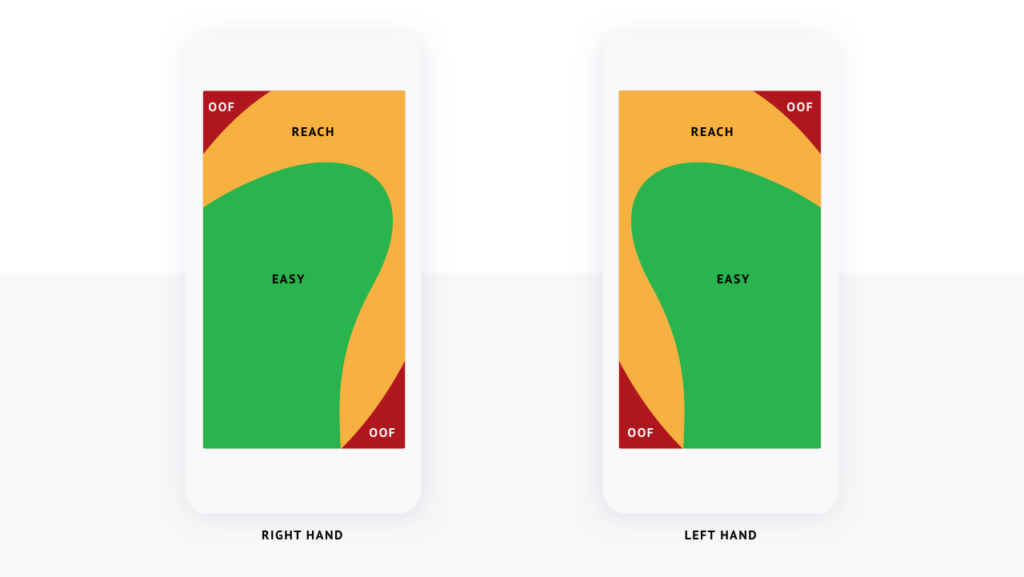
For users that touch the screen with one thumb, some parts of the device screen are easier to reach.
In his article, Design for Fingers, Touch, and People, Part 1, Steve Hoober recommends placing primary website content in the center of the screen, where scrolling and tapping is easiest. Primary actions or navigation should be locked to either the bottom edge or placed at the top end of the comfortable thumb range.
Less important actions or navigation items should be placed along the top edge, where it may require a little more effort from the user to engage.
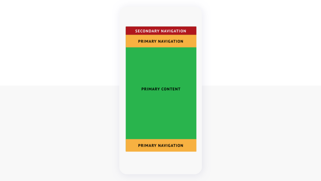
To accommodate comfortable thumb movement, keep primary content in the center of the screen, with important navigation at the top or bottom of the comfortable reach area, and less important functionality at the top edge.
A good example of prioritizing navigation for comfortable thumb reach is the ridesharing app Lyft. The app’s primary function, hailing a ride, is easy to reach at the bottom of the screen. Additional features, like profile and payment information, are placed behind a secondary menu at the top.
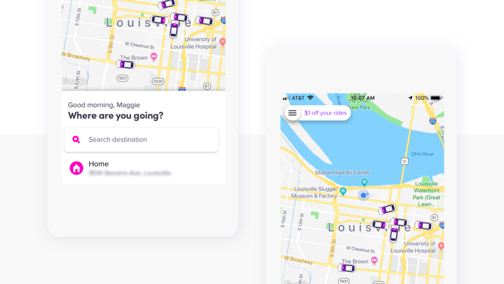
Lyft locks primary actions to the bottom of the screen, and stores additional functionality behind a secondary menu in the upper left.
So, now that we know more about thumb reach and ideal content, feature, and action placement, what else do we consider when designing navigation for mobile?
Common Mobile Navigation Design Patterns
Over time, design patterns evolve and converge to what designers and product leaders have found works the best. Some of the most used and recognizable patterns are hamburger menus and tabbed navigation.
Hamburger Menus
One of the most popular and enduring mobile navigation patterns is the hamburger menu. “Hamburger menu” is the name for the three horizontal lines stacked on top of each other that hide the rest of a navigation menu. Primarily used on responsive websites, they can also be a great solution for specific types of products. As Raluca Budiu, of the Nielsen Norman Group, writes, “Hamburger menus accommodate a large number of options, but these options are less discoverable.” For users, out of sight usually means out of mind, so menu items hidden behind a hamburger button get less interaction than items the user can see directly on the screen, but also helps your users focus on what’s on the screen.
Menus that solely rely on hamburger buttons work best on sites and apps where browsing is the primary functionality, and storing less important actions behind a menu isn’t an issue. In other types of menus, the hamburger icon should only be used for actions or destinations that aren’t the highest priority.
Another important navigational component to consider for your website on mobile is the footer. We’ve seen it left as an afterthought, but heat mapping experiments demonstrate the same (or higher) levels of engagement between the header navigation and footer navigation. Making sure users have a clear next step and map of options in your footer will minimize frustration, and will give users a reason to stay on your site. Plus, footers make your site’s link architecture flatter and more crawl-able, which is helpful for SEO.
Tabbed Navigation
If you can prune your navigation to between 3-5 of the most important items, a tabbed navigation, either locked to the bottom of the screen or to the upper thumb range, can be a great solution. If you’d like to use icons on your tabs, it’s helpful to include short, clear text labels, so users know what to expect. This solution works great for mobile apps and progressive web apps.
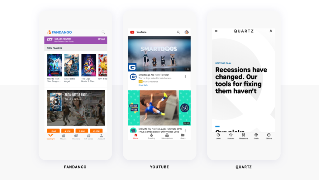
Fandango, YouTube, and Quartz all use bottom tabbed navigation for primary actions on their mobile websites.
Combining Tabs and Hamburgers
If you have lots of content, features, or functionality, you can still benefit from a tabbed navigation on mobile. Show up to four of the most important actions or destinations on your tabs, and hide secondary features or functionality behind a “more” or “menu” tab. This is often called the “Priority+” approach and can be seen in the Quartz example above.
Conclusion
You should always design your website or application with your target users and their objectives in mind. Considering how they both hold and use the device they’re viewing your product on goes…well…hand-in-hand. While there is no single layout that works for every product or every user, sticking to what most people can comfortably reach should set your website or application up for success.
Other Relevant Articles
Read more posts about Experience Design