Dark patterns are deceptive design tricks that make people perform an action on a website or in an app that they didn’t mean to do or would not have done, had their user behavior not been intentionally manipulated.
But I’m careful about my online behavior. Surely I haven’t been duped by dark patterns, have I?
Unfortunately, we’ve all been there. We signed up for a free trial, uploaded our credit card information, and six months later we’re hit with a mysterious $9.99 charge reminding us that we signed up for…something. Or how about that pop-up window that guilt trips us into subscribing to yet another email list in exchange for the promise of 10% off a future order?
At the other end of this, of course, is the marketer or product manager whose compensation is tied directly to increasing a certain metric. They’re being told, “The more subscribers the better. At all costs.”
These incentives have given rise to the use of dark patterns.
What are dark patterns?
Dark patterns are artfully designed user interfaces that manipulate users into performing actions they wouldn’t have otherwise done–including giving up personal information or subscribing to a service–at the benefit of the company.
A brief history of dark patterns
Dark patterns take carefully thought out principles of good UI and UX design and turn these principles, well, dark. These are all too common on the web because they create short-term benefits for companies. However, businesses will find that these shortcuts erode customer satisfaction and trust over time.
So why do dark patterns exist? The main goal is to drive conversions and other business goals. What makes a dark pattern negative is that they achieve the goal at the expense of customer experience.
Like many issues, these patterns are born from misaligned incentives. For example, a product manager who is tasked with hitting a single KPI such as reducing churn, or a marketer is being held to reaching a certain number of email list sign-ups per week. And while these teams may be able to show short-term rewards based on these numbers, they wind up producing a poor experience for users, which can result in negative effects in the long term.
When did the use of dark patterns become popular?
Growth hacks became popular around 2010, when the term was coined by Sean Ellis, founder, and CEO of the online community GrowthHackers. While his intentions were pure–essentially boiling down to finding creative ways to grow–some people took the methods to the extreme. This resulted in some of the dark patterns that juice short-term metrics at the cost of long-term performance. In fact, the phrase “dark patterns” was also coined in 2010, by UX Specialist Harry Brignull.
Let’s dive into what dark patterns actually look like.
Examples of dark patterns
How many of the following dark patterns have you come across in the past few days alone?
Manipulinks and Confirmshaming
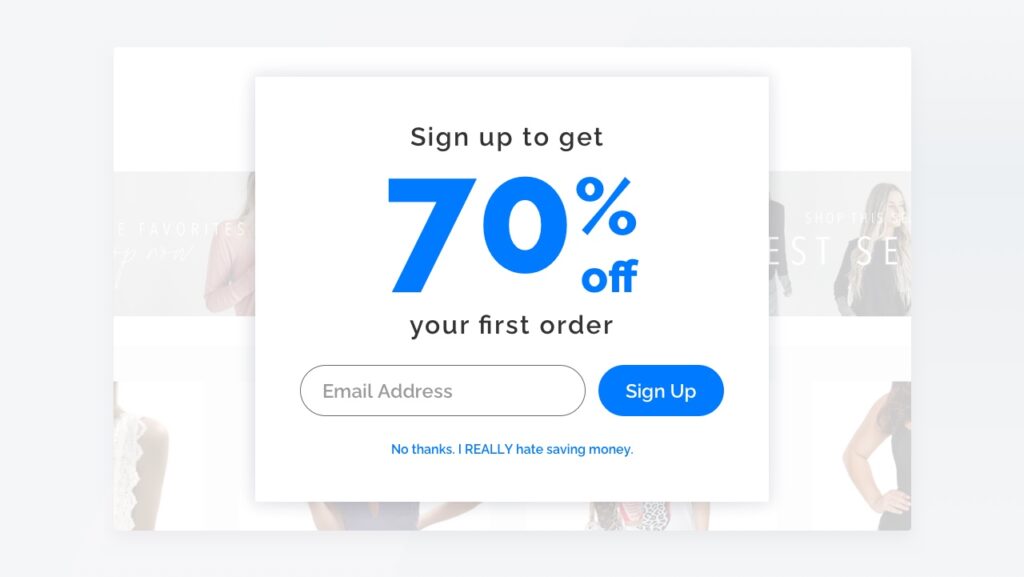
Manipulinks and confirmshaming are two examples of negative opt-outs that take advantage of users’ emotions to try and increase sign-ups. These tricks aim to guilt the user into opting in by using language that makes them feel ashamed about opting out. You may have come across this on e-commerce sites, news sources, travel sites, and many others.
Manipulinks and confirmshaming can look relatively benign, like: “Sign up for our newsletter to stay informed.” To opt-out, the user would need to select, “No thanks, I don’t need important updates.” A more aggressive example common in e-commerce looks like the one below, where the user can either add their email to a list or click “No thanks, I REALLY hate saving money” or other variations such as “No thanks, I prefer to pay full price.”
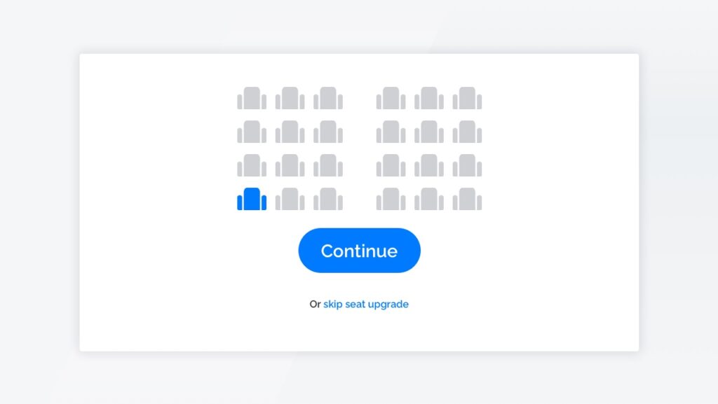
Misdirection
Misdirection entails purposefully de-emphasizing buttons, links, or options that are hurtful to the business while emphasizing the ones that are more beneficial to the business.
Customers often experience this on airline sites when they are asked to upgrade seats. The upgrade option is obvious with the big “Continue” button that looks like the default or best option, while the “skip seat upgrade” link is presented in a minuscule font.
In another example, websites will include a pop-up window over the main content, making it appear as though the website is behind a paywall requiring the user to enter their information before accessing the page. However, the content will appear if the user simply scrolls to the bottom of the page without entering any personal information.
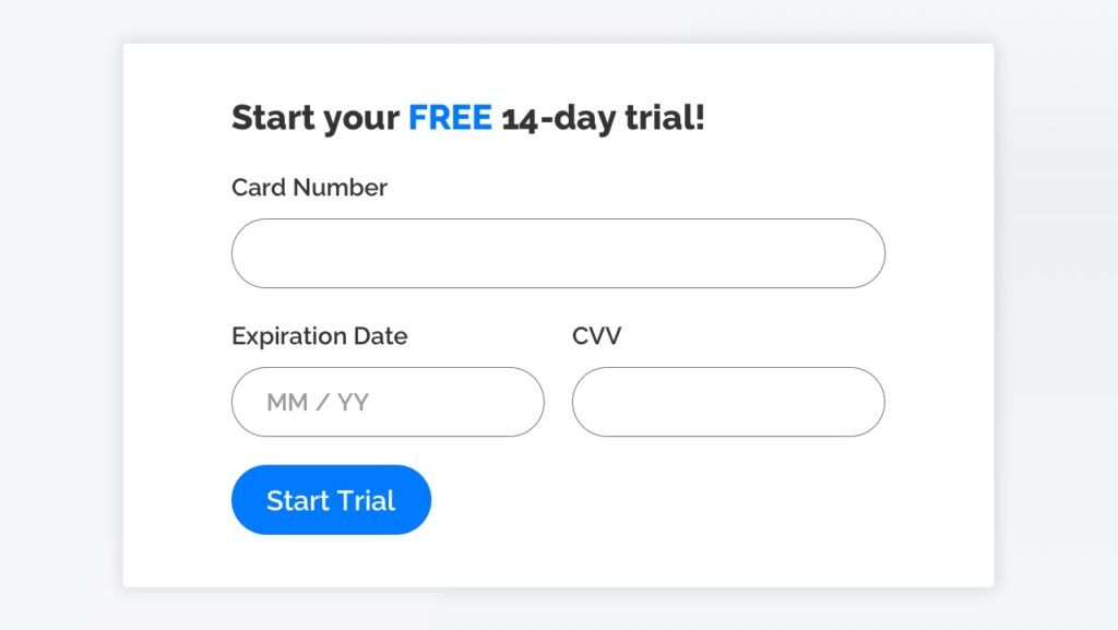
Forced Continuity
When a user signs up for a free trial, they are forced to enter their credit card details and are automatically charged when the trial ends. Often, it is VERY difficult to cancel the subscription. The user may have to dig deep into their account settings and go through a multi-step process (which can include talking to a chatbot or real person) before being able to cancel. You may have experienced this if you’ve ever tried to cancel a meal kit subscription service after receiving a week’s worth of free dinners.
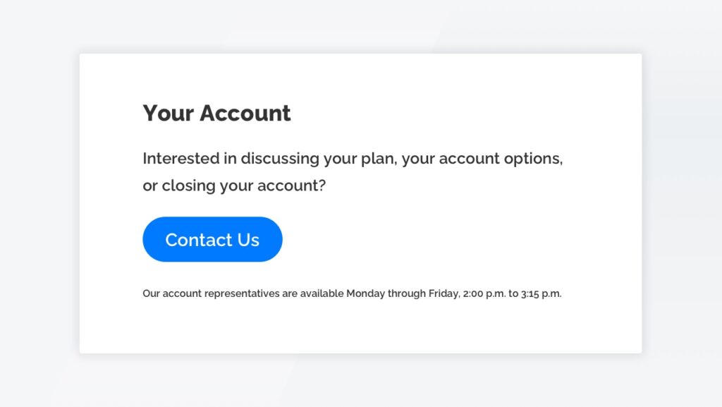
Roach Motel
The roach motel model is similar to forced continuity, when it’s really easy for a user to get into a situation (like a subscription), but very difficult to get out. Some iterations of this pattern require multiple steps, prompts, and even phone calls to get out of the subscription or close the account. Some companies will also send you a link via email or text message to make you confirm your account closure.
There are even companies dedicated to helping users delete their accounts and cancel subscription services from popular websites.
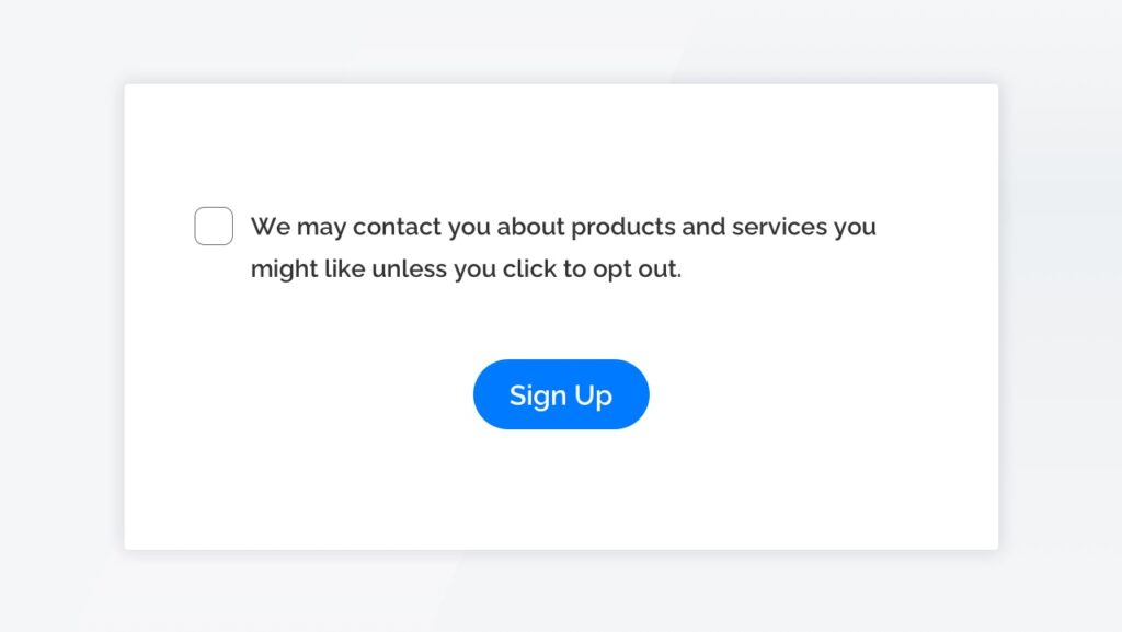
Trick Questions
In this model, companies deceive users by asking questions that are purposefully confusing and use double negatives such as “don’t uncheck the box if you’d like not to opt-out.”
Often, you’ll see questions like the one below on opt-in forms, where the construction of the sentence of the “opt-out” checkbox is purposefully confusing, and causes users to unintentionally opt-in.
Are dark patterns legal?
Dark patterns are starting to be referenced in laws, though not explicitly by that name. Government regulations such as the newly-approved California Consumer Privacy Act (CCPA) regulations address dark patterns as they apply to privacy and security. The new CCPA regulations, which went into effect on March 15, 2021, ban the use of dark patterns that have “the substantial effect of subverting or impairing a consumer’s choice to opt-out” when their personal data is being sold. While these regulations do not apply to all dark patterns or businesses, it’s a step in the right direction for consumer privacy.
We’re also starting to see companies make product choices that address dark patterns. For example, Apple has started giving users the explicit ability to opt-in to IDFA (Identifier for Advertisers) tracking, a unique identifier for iPhones that Apple uses to measure advertising effectiveness on an individual level. This is a win for consumer privacy, although it means marketers and advertisers will have to turn to new tactics.
Good UI/UX is good for business
While employing dark patterns can lead to short-term success, these deceptive tactics can harm consumers’ perceptions and brand loyalty.
We could continue discussing dark patterns from an ethical and legal standpoint, but what it all boils down to is this: good UI/UX is good business strategy. Plain and simple.
We want to help you create long-term growth that benefits both your business and your customers.
Interested in learning more about how we can help you get there? Connect with us about how we can partner with you to translate your design ideas, challenges, and goals into enjoyable, exceptional quality user experiences.
Related Posts
Dark patterns are design tricks that make users perform an action they didn’t mean to – but there’s much more to them than that. Learn here.
Experience Design