Slowly, and then all at once, the internet has become our new public space. We bank online, gather online, vote online, date online, shop online, and much, much more. Like their physical counterparts, these experiences must be accessible to everyone.
And even though it’s not as evident to the general population, accessibility in website design is also an important tenet in Diversity, Equity & Inclusion efforts. It’s all about creating a level playing field for every person to participate equally and without impediments.
As more and more organizations recognize this need, they’re faced with a common problem: where do we begin?
Well, we’re here to help. Because the companies that deliver more inclusive digital experiences also deliver better experiences, and create stronger relationships with their customers.
No matter your role, the right place to start is with a solid understanding of what ‘accessible design’ means, why it’s important, and how you can achieve it. In this article, our accessibility experts will cover:
- the definition of accessible design,
- the importance of accessible design,
- risks of ignoring accessible design,
- standards & benchmarks of accessible design,
and more. But for now, let’s start with a baseline understanding of what ‘accessible design’ means in simple terms.
What Is Accessible Design?
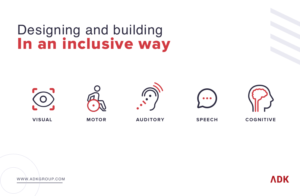
Accessible design is designing and building your product, website, or app in an inclusive way – one that can be used by an audience that includes users who may have visual, motor, auditory, speech, or cognitive impairments.
Just over 1% of the U.S. population has a visual disability according to a 2018 study. Less than 2% of the world’s top one million websites are capitalizing on the disability market. And 97.4% of home pages had detectable WCAG 2 failures according to a 2020 WebAIM Study.
Many people think accessible design is at odds with a good user experience (UX) and that you need to trade one for another. But it doesn’t have to be this way – accessibility and UX can and should go arm in arm. To see the connections and differences between UX and accessibility, let’s dig a little deeper.
Good UX involves taking a human-centered/user-centered approach to to the design and development of your product, application, or website and crafting an experience around the needs, and desires of the target audience. With accessibility, you’re really just including users of ALL abilities within that target audience.
From this basis, it’s clear that accessibility is not just a part of UX, but a core aspect of providing a great user experience. Top-tier product teams understand that accessible design (and UX/UI) is not the end of the journey – principles of accessibility need to be carried through in the code as well. In future blog posts, we’ll dive into developing accessible experiences, but for now we’ll stay focused on applying these ideas to the design phase.
If you’re reading this, you’re likely a marketing, innovation, or experience expert that’s part of a larger business team working on a website redesign or application development project. It may not be obvious, but everything you want to accomplish with your website or app involves understanding the basics of how to achieve an accessible design.
While this article is a good introduction to accessible design you can read ADK’s article that goes deeper into accessible design basics. The article shows how the concepts are all based on common sense once you understand the basic rules.
This approach starts in your team’s initial conversations, where you decide project goals based on customer/visitor needs. Building on our basic understanding of accessible design, we next need to answer the question of why it’s important and to whom?
Why is Accessible Design Important?
As the ultimate “public space,” it’s important to make the internet and all of its vital information accessible to everyone who tries to access it. There are three big considerations giving this importance: It makes good legal, business and moral sense. And much like the relationship between accessible design and UX, those three realities are highly connected.
Accessible design from a legal perspective
The legal argument is most straightforward: accessibility laws have long existed to help people with disabilities and they apply to digital experiences as well. As we’ll see in the legal risks section, thousands of companies get sued every year for failing to provide accessible experiences.
A recent Spotify article highlighted investments they made in improving the accessibility of their mobile experience. By focusing on color, text formatting, text size, and transcriptions Spotify is following through on their mission to create an immersive artistic experience everyone can enjoy.
Accessible design from a business perspective
The legal case also leans directly into the business case, in a sense: avoiding costly lawsuits is good for a healthy P&L. But it isn’t just a way to avoid fines. You can actually create competitive advantage, brand equity, and reach more customers through accessible design. In fact, more than seven out of 10 web users with disabilities will leave non-accessible websites and search for one that is, according to a UK study.
In many instances, accessible design principles are the same as good marketing or design principles. For example, when making videos for your website or a social ad (in fact, especially a social ad) captions are a no-brainer. In a recent study from Verizon Media, 80% of consumers are more likely to watch an entire video if it has captions. And 80% of people who use captions aren’t deaf or hard of hearing. So while captioning all your videos helps people who can’t hear, it also lets the vast majority of other people get your message as well. This concept also applies to things like high contrast on your website – it’s useful for both users with low vision and people using their phone or laptop in the sun.
Accessible design from a moral perspective
Finally, we believe strongly in the moral responsibility we have as designers and builders to create experiences that are not exclusionary, and are instead inclusive. To demonstrate, you can try a simple thought experiment and replace “people with disabilities” with any other group of people (people of a specific gender, people of a certain height, etc.) and think of how absurd and wrong it would be to create an otherwise broadly targeted social media website or food delivery app that didn’t work for them.
Every website and app should follow accessible design principles for these reasons, but the benefits of doing so often carry risks you cannot ignore.
The Risks of Not Designing for Accessibility
As the lines between what we buy and who we are blur, where we spend our money becomes more about choosing morally forthright companies over others. Doing the right thing morally via accessible design improves your public image and helps differentiate your brand as being consciously empathetic to everyone’s needs. Accessible design can have a halo effect as many users may assume that your business takes other concerns, like security, privacy, and customer service, just as seriously.
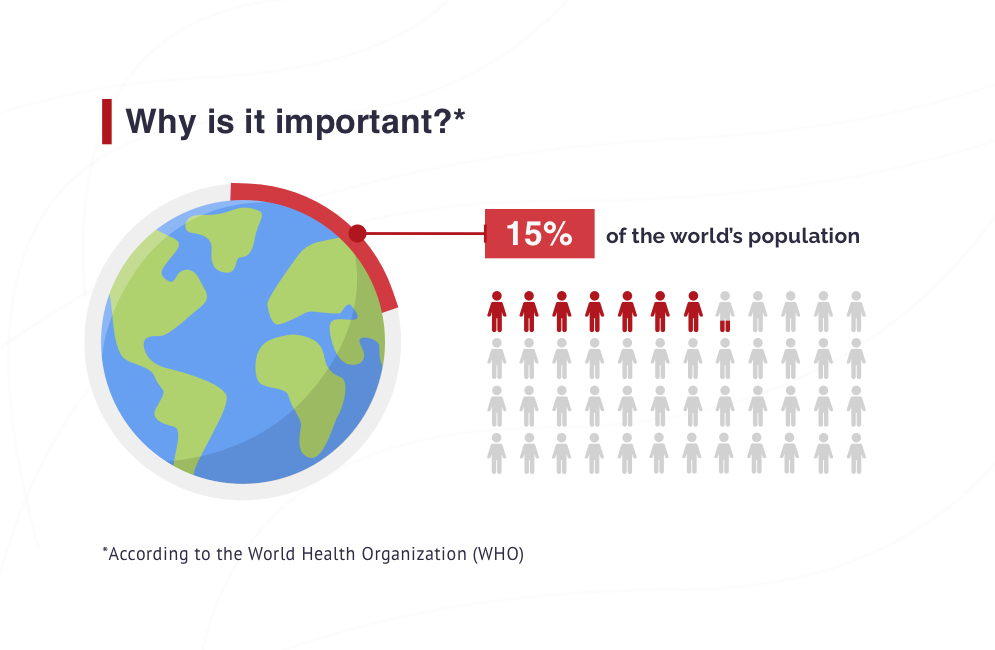
Fifteen percent of the world’s population has some form of disability according to the World Health Organization (WHO).You could exclude up to 15 percent of the world’s population from your experience if you don’t make your design accessible.
Business is all about increasing your share of a finite market with many competitors. When you exclude a percentage of the market because of inaccessible design, you limit your market share. And as we’ve discussed above, that’s not just a business concern.
Legal Risks
Oftentimes, the legal justification for making your website or product accessible is the first thing people think of when they think about accessibility. Your legal department certainly should know that poor site accessibility can lead to lawsuits.
In 2020 alone, there were 2,058 accessibility lawsuits filed and over 265,000 website accessibility demand letters sent to businesses, according to an Acccessibility.com report.
That likely translates to billions in legal fees, damages and website redesign costs. And company size, products, services, markets served, or low reliance on the website for business can’t insulate you. Plaintiffs have sued companies and entities from the largest to the smallest for inaccessibility, which can bring:
- Legal fees
- Fines
- Compensatory damages
- Urgent website redesign expenses to meet accessibility guidelines
Plus, there’s the risk your brand’s legal troubles get pulled into the public eye. And this sort of press can be devastating for your audience’s perception of the moral fibre of your company.
Moral Risks
The business and legal implications are clear, but the moral stain of exclusion may linger well beyond the point of rectifying the situation. It’s especially true if you’re a huge brand or service provider.
Larger public and private entities are more at risk for repercussions from an inaccessible website. These challenges are greatest for financial, healthcare, ecommerce, and government/civic sector entities. While all these sectors are vital for nearly everyone, every public and private website with poor accessible design is at risk from a business, legal, and even moral perspective.
Accessibility is bigger than not being able to navigate the site. Your website’s design can determine if a user can log into their bank account or make a healthcare appointment. That’s a terrible experience with massively frustrating outcomes for somebody trying to use something essential to their lives.
What is ADA Compliance?
We’ve established why it’s important to have an accessible design for your website or product from a business, moral, and legal standpoint. But with so many kinds of challenges a user can face when accessing your website, from dyslexia to deafness, how do you make that a reality?
A great place to start is to understand how accessible design fits into the Americans with Disabilities Act (ADA) compliance framework. We can gain that understanding with a little background on what ADA is and how it expanded to encompass needs in the digital age.
The Americans with Disabilities Act in the 1990s mandated enabling access for individuals in public space and public life from schools and transportation to general business and building access. ADA provided guidelines and mandates for physical access to people with cognitive disabilities or issues around mobility. As the internet has become a new public space, the ADA has been adapted to address the needs of people with physical, sight, hearing, speech, touch, learning and other disabilities.
WCAG Guidelines and The Internet as Digital Public Space
You should think of your product or website as a virtual public space. There are regulatory mandates (ADA) that say you must make it as easy as possible for everyone needing access to any public space. There are guidelines that you can follow that make it easier to understand what is and is not accessible. These guidelines can be found in the recently updated Web Content Accessibility Guidelines (WCAG 2.2). There are different guideline levels that include:
- AA level, which is the level most websites should meet.
- AAA level, which is more stringent and reserved for websites or products catering specifically to audiences with accessibility needs (like a website for the blind or visually impaired)
The Americans with Disabilities Act follows this set of guidelines and rules for an accessible design. The rule of thumb is, if you’re meeting or making a good faith attempt to meet those guidelines, you’ll be ADA compliant for accessible design. To learn more about ADA compliance, read our ADA Compliance How To Guide.
Accessible Design vs. Inclusive Design vs. Universal Design
There are several terms related to accessible design that enable you to think about different aspects of what the concept means. It can also be a little tricky to tell them apart. Here are some concepts that are often used interchangeably, but actually have subtle differences.
Universal design
Universal design attempts to find the ONE solution that works best for the largest number of people. Universal design seeks to improve the product or space for everyone, as opposed to making improvements to accommodate a specific individual or user. Universal design has origins in industrial design, interior design, and architecture, but the methodology has more recently been applied to experience and product design.
The difference between accessible design and universal design is that accessible design seeks to provide equivalent experiences for users who may have specific, individual needs. There may be alternate ways to access content for users who may have disabilities, like including captions, allowing for keyboard navigation, and ensuring the information is structured properly for a screen reader. Accessible design provides multiple solutions for multiple types of users, as opposed to universal design, where one solution is meant to satisfy the largest number of users.
Accessible Design
Accessible design is based on accessibility guidelines published by government and industry groups, which aim to make sure people who may have disabilities can access the information on websites and other digital products.
Inclusive Design
In addition to making modifications for users who may have disabilities, inclusive design takes that line of thinking even further. Inclusive Design considers the full spectrum of human diversity, seeking to find solutions for users who may have different cultural backgrounds, different identities, and different social perspectives in addition to users who may have disabilities.
Accessible design doesn’t always consider different identities, cultures, or social perspectives. It focuses more on modifying and adapting content to support different methods of interaction. While inclusive design and accessible design aren’t really the same thing, accessibility is one positive outcome of an inclusive design.
Usability
Usable design is more closely associated with good user experience, but good UX doesn’t always include usability because usable design focuses on the target audience. However, accessibility standards are a subset of usable design because if your website is accessible it’s going to be usable in every instance. You can build a usable website that is accessible and that should be the target. By designing for accessibility, it will also end being a usable site, application, or product.
Your First Step? Conduct an Accessibility Audit
Armed with an understanding of what accessibility is and why it’s important the natural next step is to apply it to your product. How can you best reap the benefits of delivering an accessible experience, especially if your product is already in the hands of hundreds, thousands, or millions of people?
The best place to start is with an accessibility audit. At a high level, an accessibility audit measures how well your experience complies (or fails to comply) with a target WCAG Version Level, either A, AA, or AAA.
WCAG Version Levels range from A, to AA, to AAA, where each level is more intensive than the previous one. Level A is the minimum level of conformance, but may still provide a sub-optimal experience. Level AA includes all Level A requirements, plus additional requirements. Most organizations strive to meet Level AA as a sitewide goal. In fact WCAG documentation recommends against requiring Level AAA conformance as a sitewide policy because it is oftentimes impossible.
When conducting an accessibility audit, you or your partner needs expertise and experience in the criterion for each version level, as well as the know-how for testing how well your experience complies with each criterion. Because Level AA conformance is the popularly accepted standard, it’s important to get an idea of what it takes to achieve that. Below is a non-exhaustive list of criteria required to be WCAG 2.1 Level AA conformant.
Alternatives
- All images, video, audio, and non-text content include appropriate text alternatives.
Presentation
- Use of proper markup techniques is used to structure your website’s content.
- Content is presented in a meaningful order and sequence so that it reads properly.
- Detailed instruction is made available to all sensory abilities.
- A color contrast ratio of at least 4.5:1 between all text and background.
- Users have the ability to resize text up to 200% without negatively affecting the ability to read content or use functions.
- Website should not lock on or require a single display mode.
- Make it so forms can autocomplete information for users.
- Ensure someone can zoom in on your website without requiring scrolling or without causing poor experience.
- All meaningful non-text content on your website should have sufficient contrast with the background.
- Text spacing is able to be adjusted without causing a poor experience.
- Any additional content (e.g. pop-ups, submenus) can be dismissed or remain visible if the user desires.
Controllable
- Content and functions on a website is accessible by keyboard only.
- Keyboard-only users never get stuck on any part of the website; they are able to navigate forwards and backwards.
- Users are able to control any components with a time limit. Users have the ability to turn it off, adjust it, extend it.
- Content that blinks, scrolls, or moves: Users have the ability to pause, stop, or hide it.
- Web pages do not contain anything that flashes more than three times in any one second period.
- A “Skip to Content” or “Skip Navigation” link is implemented to allow users to navigate straight to the main content.
Understandability
- Each page has a unique and descriptive page title.
- Users are able to navigate through the website in a logical sequential order that preserves meaning.
- The purpose of each link is clear based on its anchor text .
- Headings and programmatic labels are clear and descriptive.
- Any “user interface control” that receives focus from a keyboard user indicates that focus is on the current selected element.
- Website language is set.
- Make sure any programmatic labels you make are aligned with the corresponding visual text.
Predictability
- All user interface components (including forms, links, components generated by scripts), the name, role, and value can be programmatically determined.
- Proper form labels, instruction and validation are used.
- When a status message appears, it should be coded properly so that people using assistive technologies (e.g. screen readers) are alerted without losing focus
While there are many accessibility audit tools that can help establish baselines, the real value of an audit is in understanding how to make improvements and how to prioritize those. Some of the activities that drive this are:
- Automated tests
- Manual code, UI, and UX tests
- Partnering with organizations like the Carroll Center for the Blind
- Testing using screen readers
These tests also need to take into account the different browsers and devices that users may be using to access your experience.
At the end of it, you should have a clear roadmap for delivering a more accessible experience to all of your users.
Think your website or app needs to be more accessible?
You’re probably right. While some organizations are making leaps and bounds towards delivering accessible experiences, many are still falling short. Start a chat with one of our Accessibility Experts today to see how you can improve your product and brand experience through accessibility.